Using the performance dashboard
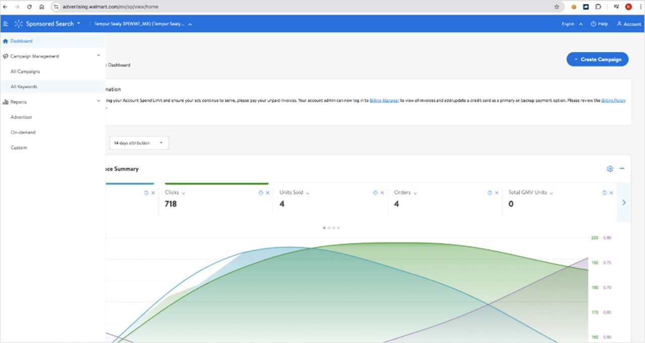
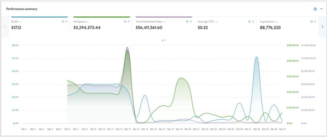
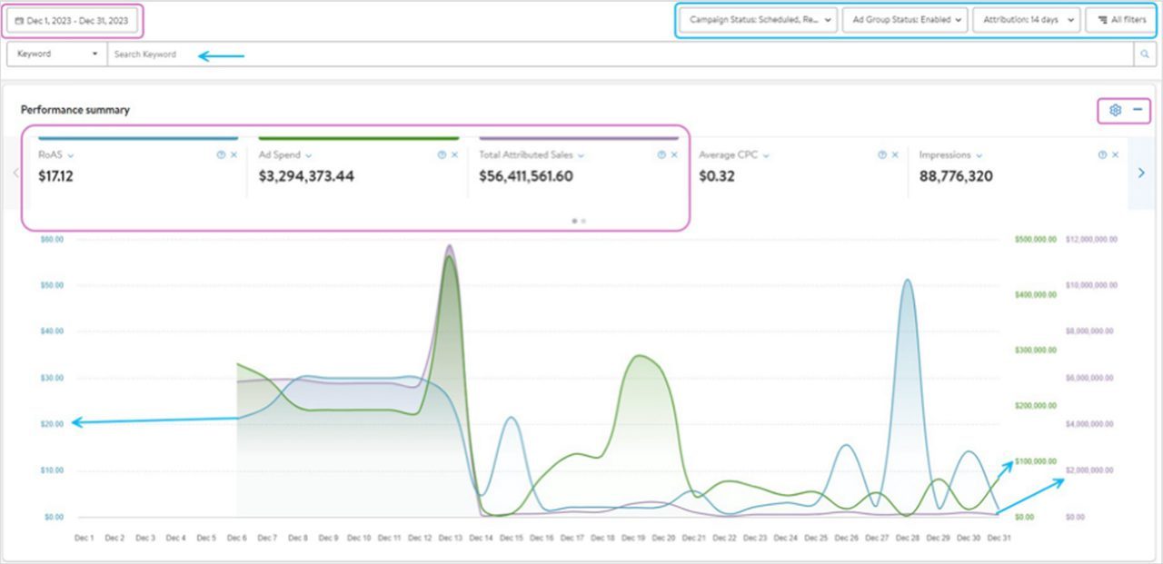
The performance dashboard shows, by default, the first three metrics: ROAS, ad spend and total attributed sales. You can easily switch between metrics by selecting them along the top. Up to three metrics can be displayed at a time, so if you select a new metric to display without deselecting one, the graph will automatically deselect a metric starting on the left. All performance and conversion metrics are available but can be easily removed by clicking on the X next to them or from the settings icon on the graph.
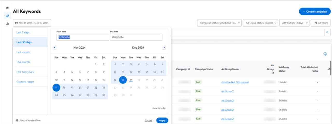
Y-axis dimensions are colour-coded along the left and right side of the graph to correspond to the colour of the lines on the graph. The graph can be manipulated by selecting different date ranges, campaigns, attribution windows, campaign statuses and custom filters. Date ranges greater than one month are broken into weekly dimensions, and those greater than six months are broken into monthly dimensions along the x-axis.


